Bootstrap Alert Tutorial
Overview
The alerts are from all these components you even do not think of until you actually get to need them. They are put to use for presenting fast in time information for the user working with the web-site hopefully aiming his or hers attention to a specific course or evoking special actions.
The alerts are most often used together with forms to give the user a recommendation if a area has been filled out wrongly, which is the effective format expected or which is the status of the submission once the submit button has been pressed.
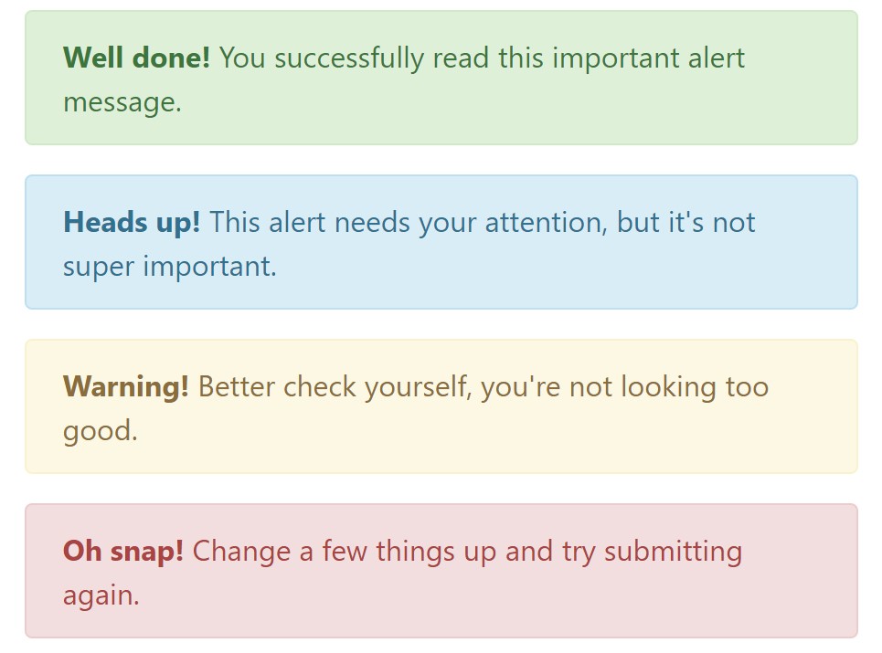
As a lot of the elements in the Bootstrap framework the alerts also do have a well-kept predefined visual aspect and semantic classes that can be used according the particular case in which the Bootstrap Alert has been shown on display. Because it's an alert text message it's important to take user's attention but after all leave him in the zone of comfort nevertheless it might even be an error message. ( click here)
This gets achieved by the use of delicate toned color options each being intuitively been connected to the semantic of the message material just like green for Success, Light Blue for general info, Pale yellow seeking for user's interest and Mild red indicating there is in fact something wrong.
<div class="alert alert-success" role="alert">
  <strong>Well done!</strong> You successfully read this important alert message.
</div>
<div class="alert alert-info" role="alert">
  <strong>Heads up!</strong> This alert needs your attention, but it's not super important.
</div>
<div class="alert alert-warning" role="alert">
  <strong>Warning!</strong> Better check yourself, you're not looking too good.
</div>
<div class="alert alert-danger" role="alert">
  <strong>Oh snap!</strong> Change a few things up and try submitting again.
</div>
Color option of the web links
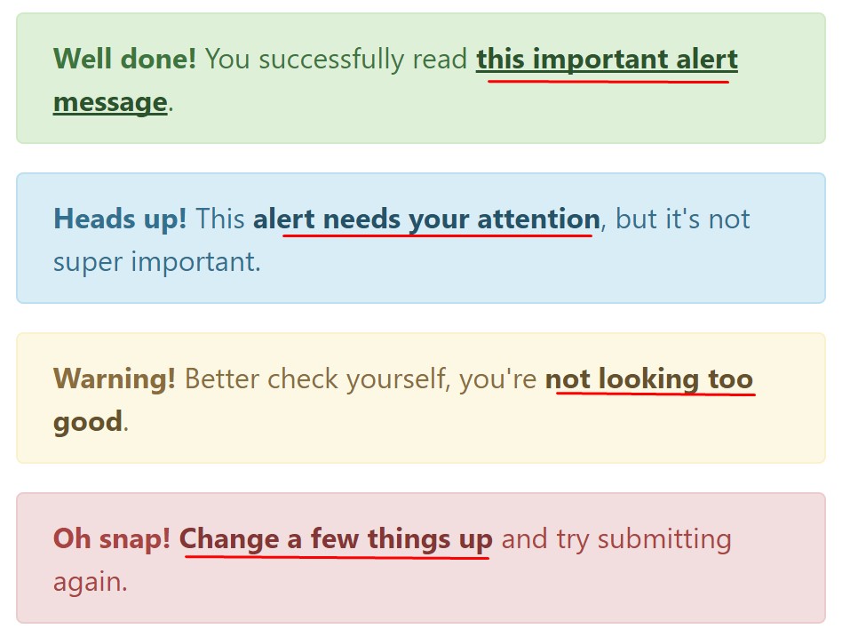
This might not be seen at a glance but the font colour also is actually following this color design too-- just the colours are much much darker so get intuitively takened as black but the truth is it's not exactly so.
Same goes not only for the alert text message itself but as well for the web links incorporated in it-- there are link classes taking out the outline and colouring the anchor elements in the proper color tone so they fit the overall alert text look.
<div class="alert alert-success" role="alert">
  <strong>Well done!</strong> You successfully read <a href="#" class="alert-link">this important alert message</a>.
</div>
<div class="alert alert-info" role="alert">
  <strong>Heads up!</strong> This <a href="#" class="alert-link">alert needs your attention</a>, but it's not super important.
</div>
<div class="alert alert-warning" role="alert">
  <strong>Warning!</strong> Better check yourself, you're <a href="#" class="alert-link">not looking too good</a>.
</div>
<div class="alert alert-danger" role="alert">
  <strong>Oh snap!</strong> <a href="#" class="alert-link">Change a few things up</a> and try submitting again.
</div>
Special important information for alerts
A thing to indicate-- the colors take their clear meaning just for those who actually get to notice them. So that it's a good idea to either ensure the visible text itself carries the meaning of the alert well enough or to eventually incorporate some extra information to only be seen by screen readers in order to grant the page's accessibility .
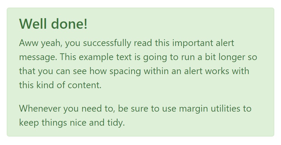
In addition to links and basic HTML tags like strong for example the alert elements in Bootstrap 4 can also contain Headings and paragraphs for the circumstances when you want to present a bit longer information ( more info).
<div class="alert alert-success" role="alert">
  <h4 class="alert-heading">Well done!</h4>
  <p>Aww yeah, you successfully read this important alert message. This example text is going to run a bit longer so that you can see how spacing within an alert works with this kind of content.</p>
  <p class="mb-0">Whenever you need to, be sure to use margin utilities to keep things nice and tidy.</p>
</div>
Reject the alert
You can at the same time add an X icon to dismiss the alert and bring in a cool transition to it to once again assure the visual comfort of the Bootstrap Alert Example visitors.

<div class="alert alert-warning alert-dismissible fade show" role="alert">
  <button type="button" class="close" data-dismiss="alert" aria-label="Close">
    <span aria-hidden="true">×</span>
  </button>
  <strong>Holy guacamole!</strong> You should check in on some of those fields below.
</div>
Currently there are four kinds of contextual alert messages in Bootstrap 4 framework - they are titled Success, Info, Warning and Danger. Do not allow however their titles to limit the manner you're working with them-- all of these are simply some color schemes and the method they will be actually implemented in your site is entirely up to you and fully depends on the specific circumstance.
-- if the color scheme of your page utilizes the red as main color it might be quite appropriate to display the alert for successful form submission in red too using the predefined alert danger appearance in order to better blend with the page and save some time defining your own classes.
The predefined alert classes are just some consistent appearances and the responsibility for using them lays entirely on the designer's shoulders.
JavaScript activity of the Bootstrap Alert Colors
Triggers
Enable dismissal of an alert through JavaScript
$(".alert").alert()Enable termination of an alert via JavaScript
Or perhaps with information attributes on a button inside the alert, as demonstrated above
<button type="button" class="close" data-dismiss="alert" aria-label="Close">
  <span aria-hidden="true">×</span>
</button>
Notice that shutting off an alert will take it out from the DOM.
Options
$().alert()$().alert('close')Events
Bootstrap's alert plugin exposes a few events for netting in alert capability.
close.bs.alertclosed.bs.alertInspect several on-line video training regarding Bootstrap alerts
Connected topics:
Bootstrap alerts formal information
W3schools:Bootstrap alert tutorial

Bootstrap Alert Issue
